Goodreads
A user-centric redesign putting the focus back on books.
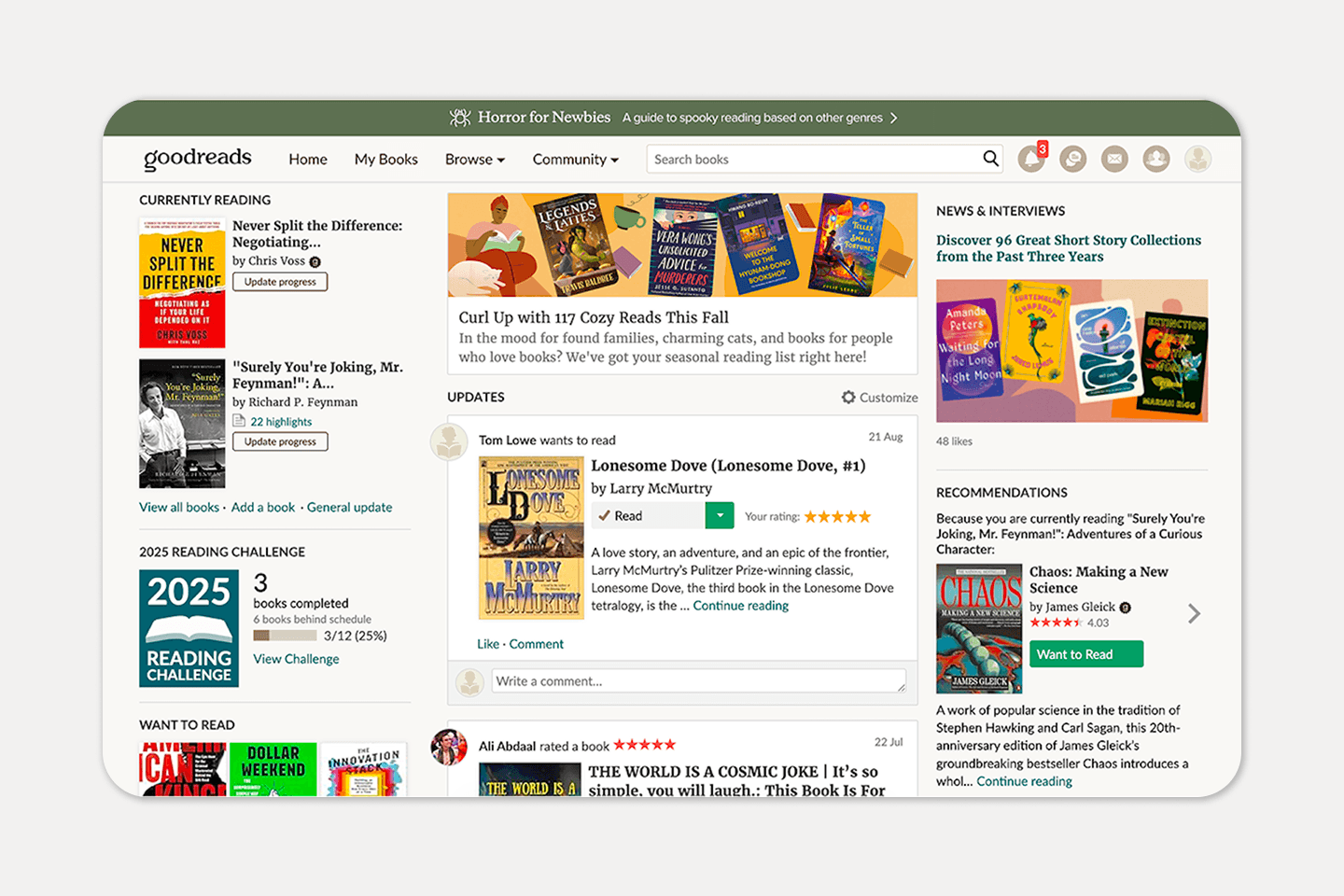
Design exercise
Problem
Goodreads is truly useful, but its interface is cluttered, dated, and gets in the way of what it's supposed to do. Visual hierarchy is weak, navigation is noisy, and the experience feels neglected.
overview
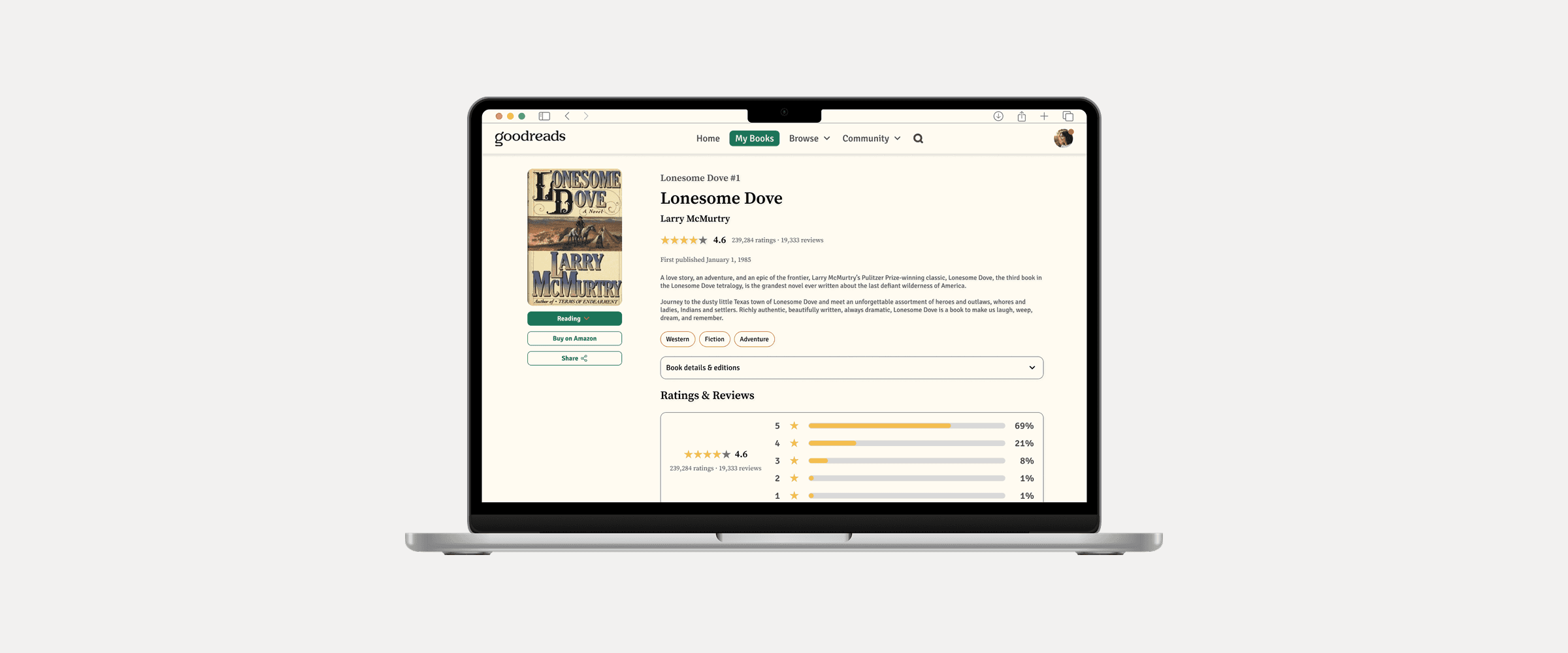
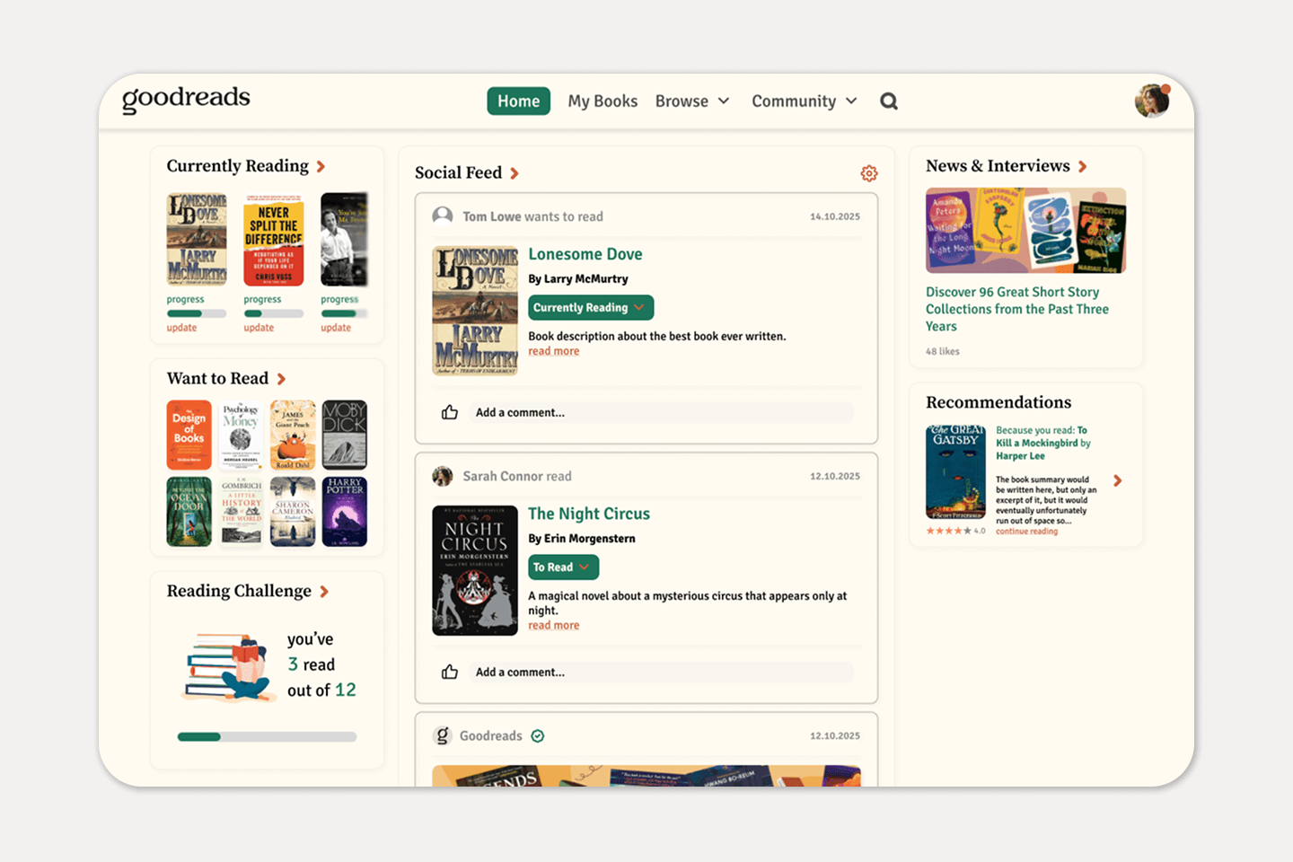
Redesigned key screens of the Goodreads website based on light user and competitor research and common platform critiques. The goal was less clutter, clearer hierarchy, and more focus on the books.
Research and Design

Solution
Who is it for? In what context?
Everyday household users, primarily adults of varying technical confidence, using the device briefly and often when already uncomfortable. Primary context: physical device, mounted on a wall.


Original
Sorry for the long letter, I didn't have time to write a short one.