Smart Thermostat
Redesigning a smart home thermostat, focusing on usability.
Design exercise
Problem
The Hive Thermostat is capable but confusing. Boosting water, changing temperature targets, and reading system state are all unclear, especially for infrequent users under time or comfort pressure.
overview
Redesigned the thermostat interface to prioritise system state visibility and predictable interactions. The scope covered core heating and hot water controls.
Personal Goals
Make system state legible at a glance. Remove ambiguity from high-impact, low-frequency interactions. Design for all technical abilities.
Users
Who is it for? In what context?
Everyday household users, primarily adults of varying technical confidence, using the device briefly and often when already uncomfortable. Primary context: physical device, mounted on a wall.
ideas
Back to basics.
Early sketches mapped the most-used features and identified where the current interface lost users. The sketch below shows the initial feature prioritisation.

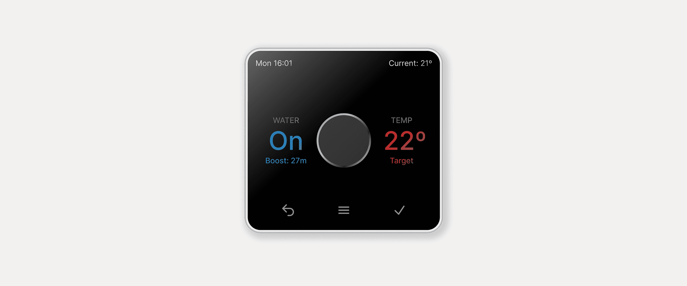
Solution
Fewer questions, faster answers.
Fixed layout: water status always on left, temperature always on right. Consistent between uses
Water section shows on/off state with boost time remaining
Temperature section always shows target; boost mode replaces 'Target' label with 'Boost: X min' - separating current from target eliminates the most common source of confusion
Boost buttons moved to the device sides for discoverability
Added a dedicated physical on/off button for confident, unambiguous control
Outcome
A thermostat that tells you what it's doing.
The redesigned interface gives users a clear, immediate read of system state without needing to interpret or guess.

Sorry for the long letter, I didn't have time to write a short one.